
Financial Dashboard - Product Design
A new way to manage your money
OVERVIEW
Design a new dashboard to help our customers to understand their finances, improve their day-to-day relationship with the bank, guide them to invest their money and help business to increase conversion rate and maximise sales.
MY ROLE
Lead product designer
User Research, Interaction, Visual design, Prototyping & Testing
2020
THE CHALLENGE
Bankinter customer dashboard has been online for more than 15 years. During that time the business has been adding new products, menus, banners, offers, etc. creating a very complex interface where there is a lot of room for improvement. After receiving feedback from our clients we identified these main problems:
Users frequently get lost. The information architecture is no well defined and our users can’t find what they are looking for. The company created this page before having a centralized design team.
Not in line with new Design System Language: After a change in brand, this page has become outdated. Also the technology needs to be updated to Angular, so we can use our new APIs developed for the new app. We also wanted to have the same visual experience.
Lack of sales and CRM spaces: Marketing team needs to send commercial messages depending on user navigation. We have a new CRM and we need to increase our ratio of conversion in new financial products customized for each individual user.
A Dashboard for everybody: We need to create a dashboard thats fulfill client expectations and help them in their day-to-day but we have very different users depending on their financial knowledge and needs.
RESEARCH
We identified four types of clients (we generated the personas to use in research):
New clients: they land on this page for the first time after joining the bank. Usually they land with 1 account and 1 credit card that is not active.
“Normal” Client: they have less than 6 or 7 products, usually a couple of accounts, 1 or 2 credit cards, a mortgage and an insurance. These clients don’t have any medium-high risk financial product. So they don’t have stocks, futures, ETFs. They usually have some savings but they don’t use them.
Investor: Usually they have between 7 till 15 products includings some advanced financial products. The most common product are stocks but they have it for a long time. They don’t trade every day, just want to visit the site to check profitability.
Broker: The most profitable client who has more than 15 products and use our dashboard as a tool.

We use this information in our Research phase where we had 2 focus group sessions with clients and prospects, we had customer 1-to-1 interviews, we collected data from our Analytics & Hotjar tools and we did a benchmarking research.
INSIGHTS
We got some interesting insights from initial research:
More than 80% of visitors log in to the dashboard just to transfer money via direct transfer or Bizum (a mobile-to-mobile payment service in Spain). Currently we need 3 clicks to access this service.
93% of clients only use a maximum of 5 bank transactions on a day-to-day basis. So they frequently use: transfer money to a person/business, check accounts, move money from one account to another one, manage standing orders and the last action depend on the type of user.
Our clients are more profitable if they have at least one financial product in the stock market. We are a bank with a lot of clients with high/medium-risk financial products. Currently our dashboard is designed for a user without this kind of products and if you have one of them you have to go to another page to check your profitability.
We need a page with all you can do on the site as many products or transactions are hidden in workflows.
Some of the products have a name difficult to understand and we don’t have an explanation or help during the process. People don’t click because they don’t know what to expect next.

OPPORTUNITIES
We identified an opportunity to change the current design adding a left column to the dashboard and create 3 new sections to help users and business. These sections are:
Most common transactions module
As we learnt from research we added shortcuts to the most frequently user transactions. These shortcuts can be defined depending on the type of user and their navigation. This module also includes a tool to add other banks to your dashboard.
PFM (Personal financial management) module
We created this module to help our users to classify their incomes and expenses in different categories so in the future they will be able to add goals, limits and budgets for different purposes.
Spots for commercial use
We create a modular space to add banners for commercial needs. This banners can also be used to introduce to our customer new services and tools.

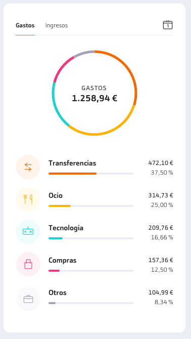


We mapped every category to create a new section where the user can organize and understand easily expenses and incomes to help them with their finances.

We also created a new section where the client can manage all their products in one place having all the options available. If a user doesn’t have a product we use this page for a commercial purpose increasing the conversion rate. If a product has a difficult name for users we also added a screen to explain the benefits that appears just first time they use it.